Table of Contents
Indicator Chart
1. Overview
The indicator chart is a visual representation of the historical market price and the indicators used in the strategy.
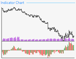
A simplified version of the indicator chart is present in the strategy editor, generator and optimizer. The black bar chart is the market price. The purple little stick chart is the tick volume. The thick volume measures the times that the price moves up and down within a given bar. There is over 90% correlation between tick volume and actual volume.
To get to the full view of the indicator chart you can either click on the simplified chart or choose it from the left side menu.
2. Indicator Chart
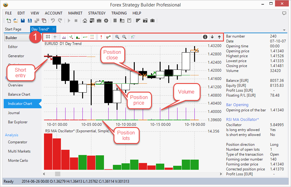
The full version of the indicator chart is using the candle chart view by default, but if you want to use the bar chart, you can switch to it by pressing the space key.
3. Toolbar
Grid – toggles the grid.
Cross – the cursor becomes a cross and lets you see the price, indicators' values and positions in the dynamic info panel.
Volume – lets you toggle the tick volume bar chart.
Entry/Exit points – toggles the display of position opening and closing. Green upwards pointed arrows show that the strategy is opening a long position. Red downward pointed arrows mark the opening of a short position. An orange horizontal line with an X on it shows that the strategy closed a position.
Position lots – shows the position amount as a stick chart at the bottom of the price area.
Corrected position price – will show the corrected price of the position by considering the spread and the swap.
Protections – if you enable those, FSB Pro will display their values as dashed lines.
Ambiguous bars – when enabled will display a red exclamation mark above each ambiguous bar.
Indicators – will show or hide the strategy indicators from the chart.
Zoom in / zoom out – you can zoom the chart by clicking on these buttons or by using Ctrl + scroll
True charts – applies only to the indicators, see below.
Info panel – will open an additional panel where FSB Pro will display additional data about the chart depending on your cursor position, such as bar number, date, opening time, closing time etc. The table in the panel is often too long to be displayed at once you can scroll it without moving your mouse by pressing Z and A (small steps) and S and X (bigger steps).
4. True Charts
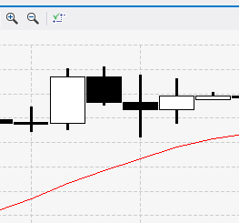
On a normal indicator chart moving average (MA) looks like a smooth line that flows from bar to bar without any rough changes. It deceivingly looks like it changes its value while it is moving throughout and between the bars and has at least a few other values while it floats trough the chart.
We have to share the truth with you: moving average has only one value per bar. This means the line should not be smooth. For example if MA’s period is 14, this means the current bar’s MA value is the average of the last 14 bars’ values. This value can be only one number. The MA value remains the same throughout the whole duration of the current bar. If represented with a smooth line it looks like MA is “moving” within the bar. 99% of the trading software out there displays MA and other indicators with smooth lines, which very often leads traders astray.
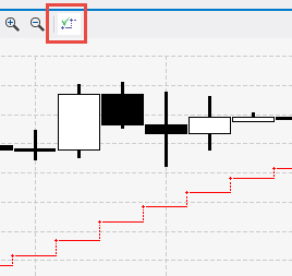
Indicators have discrete values. Their values “jump” from bar to bar, that’s why they should not be displayed with a smoothed line on charts much like you don’t use smoothed out candles to look at market changes.
This is why FSB Pro has the True Charts view allowing you to see the true values of the indicators. Indicators are constant within the bar and “jump” only between bars. The point where the indicator gets its new value is marked with a + sign.
~~DISQUS~~


